7 Web Site Mistakes That Make Customers Hesitate
A web site mistake is a problem that makes customers work harder to identify a business, confirm it fits, trust it, or make contact. The seven mistakes in this guide cover vague openings, hidden next steps, unclear service areas, weak mobile controls, slow pages, missing HTTPS, and stale information.
By Logan Moore · Updated October 7, 2026
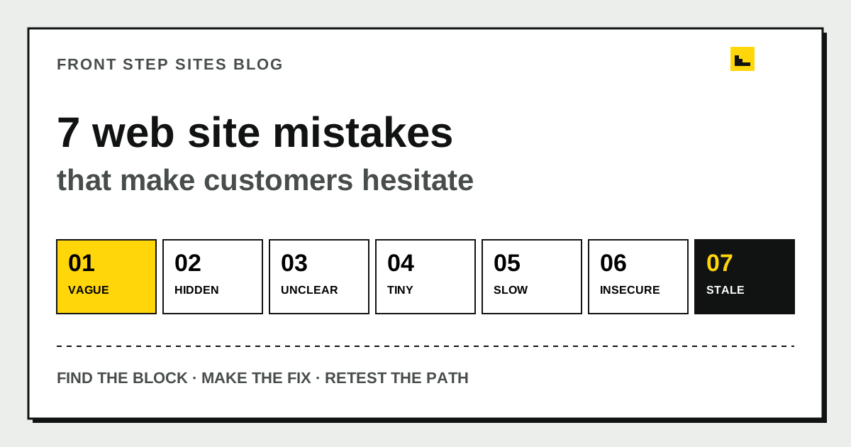
A web site mistake is a problem that makes customers work harder to identify a business, confirm it fits, trust it, or make contact. The seven mistakes in this guide cover vague openings, hidden next steps, unclear service areas, weak mobile controls, slow pages, missing HTTPS, and stale information. Fix the decision path first, then work on decoration.
Which web site mistakes deserve attention first?
The web site mistakes to fix first are the ones that block recognition, fit, trust, or action. Check the page in that order because it mirrors a customer’s visit.
| Customer needs to know | Common mistake | Quick test |
|---|---|---|
| What is this business? | Vague first screen | Cover the logo and read the opening |
| Can it help me here? | No service or location detail | Find one service and one place |
| What should I do? | Buried contact path | Count taps from landing to contact |
| Can I use this on my phone? | Small or broken controls | Try one-handed at 390 pixels wide |
| Can I trust it? | Slow, insecure, or stale page | Check speed, HTTPS, and dates |
Start at the top of your busiest page and write down each moment that requires interpretation. The first repair should remove a customer block.
Is the opening too vague?
A vague web site opening makes visitors decode slogans when they need a service, place, and next step. “Built on excellence” could introduce a roofer, accountant, or cabinet shop. “Residential roof repair in Macon, with inspections scheduled by phone” gives the visitor useful facts.
Run the logo-cover test. Hide the logo with your hand and read the first heading and paragraph. Could a stranger name the business category and service area? If not, replace the slogan with one plain sentence. Keep personality lower on the page, after the visitor knows they are in the right place.
Google Search Central recommends descriptive, concise page titles and warns against vague labels such as “Home.” That guidance helps people too. Give each page a title that names its job, such as “Water heater repair in Decatur,” rather than “Solutions.”
Is the next step hidden?
A hidden next step leaves an interested web site visitor at a dead end. Every service page should show the primary action near the top and repeat it after the main explanation. The action can be a call, estimate request, booking, order, or directions link.
Count the steps on a phone. A visitor should not open a menu, find Contact, scroll through a biography, copy a number, and paste it into the dialer. Make the visible number a working telephone link. Keep a quote form short enough to finish without collecting details you can ask during the follow-up.
One action should lead. Two actions can work when they serve different situations, such as “Call for urgent service” and “Request a planned estimate.” Six equal buttons force the customer to design the process for you.
Are the services and locations unclear?
An unclear web site attracts poor-fit inquiries and loses good ones because customers cannot confirm what the business handles or where it works. Name real services and real places. “Complete property solutions across the region” says less than “weekly lawn care in Roswell and Alpharetta.”
Build a two-column check from your last ten calls. Put the service requested on the left and the town or neighborhood on the right. Then find each answer on the site. If a profitable request has no clear page or paragraph, add it. If the site promises an area the business no longer reaches, remove it.
This does not require a page for every town. One accurate service-area section can be better than many thin pages with a place name swapped. When you do create a page, Google Search Central recommends simple, descriptive URLs that use words people understand.
Does the phone version make controls hard to use?
A phone web site fails when text needs zooming, content runs off the screen, or controls are too crowded to tap reliably. Open the page at 390 pixels wide and test with one hand.
The W3C’s WCAG 2.2 guidance sets 24 by 24 CSS pixels as the minimum pointer-target size, with exceptions for spacing and inline links. Treat that as a floor. A primary call button can be much taller, with enough space that a thumb does not hit the neighboring menu item.
Check these four places:
- The menu opens and closes without covering the main action.
- The phone number fits and can be tapped.
- Form labels stay attached to their fields.
- Error messages explain how to fix the entry.
If mobile problems begin with the site’s underlying tool, the comparison of web builder sites for a small business explains who controls edits and upkeep.
Does the page load slowly or jump around?
A slow or shifting web site makes the customer wait and can move a button just as they try to tap it. Large photos, autoplay video, third-party widgets, and too many scripts are common places to look. Measure before removing anything.
Google’s web.dev defines three Core Web Vitals targets for a good experience: Largest Contentful Paint within 2.5 seconds, Interaction to Next Paint at 200 milliseconds or less, and Cumulative Layout Shift at 0.1 or less. It recommends evaluating the 75th percentile of page loads on mobile and desktop.
Use PageSpeed Insights to identify the largest image and the elements causing movement. Compress the hero photo, give images width and height, and remove a widget that does not help a customer finish a task. Repeat the test after each change so you know what worked.
Is HTTPS missing or broken?
A business web site should load securely over HTTPS and show no browser warning. HTTPS encrypts the connection between the visitor and the site. It matters on every page, especially one that accepts a name, phone number, or message.
Type the address with “http://” and confirm it redirects to “https://.” Try both the “www” and non-“www” forms, then submit the contact form. A home-page padlock does not prove an old form or embedded booking page is secure.
The plain-English guide to SSL and the site padlock explains the certificate, HTTPS address, renewal, and mixed-content checks without requiring server jargon.
Does stale information make the business look unattended?
Stale web site information makes customers question current hours, prices, availability, and even whether the business is open. Old holiday notices and expired promotions are obvious. An old employee name, disconnected number, or service you stopped offering can do more damage.
Set a 15-minute monthly check. Read the home page, contact page, service list, hours, footer, and forms. Compare the business name, address, phone number, and hours with the Google Business Profile. Ask which incorrect expectation came up most often on calls, then fix the page that created it.
Keep account ownership current too. If the only login belongs to a former employee or web designer, the mistake is operational as well as visible. The guide to leaving a web designer while keeping your domain and site lists what to collect before access becomes urgent.
What does a worked mistake audit look like?
A worked web site audit turns vague concerns into a short repair queue. Consider a five-page plumbing site with 12 monthly inquiries. Its owner finds four issues in 25 minutes:
| Finding | Repair | Owner time |
|---|---|---|
| “Welcome” heading | Name plumbing service and town | 5 minutes |
| Phone number is plain text | Make it a telephone link | 3 minutes |
| 4.8 MB hero photo | Resize and compress the photo | 10 minutes |
| Footer shows old Friday hours | Correct and republish hours | 2 minutes |
The total is 20 minutes of edits, plus five minutes to retest. The example does not predict more calls. It shows how to choose concrete repairs that remove friction without rebuilding the whole site.
What are the frequently asked questions?
What is the biggest mistake on a small-business web site?
The biggest mistake is making the visitor guess what the business does, where it works, or how to take the next step. Fix the opening and primary action before changing fonts, colors, or animations.
How often should a business check its web site?
Check core business facts monthly and after any change to hours, staff, services, or contact details. Test forms and phone links at the same time. A deeper mobile and speed check each quarter is a sensible routine for a small brochure site.
Does a web site need a redesign to fix these mistakes?
Many web site mistakes can be repaired with clearer text, working links, smaller images, and current details. Consider a redesign when the layout cannot work on phones, the platform blocks needed changes, or access is lost.
How can I tell whether a fix worked?
Repeat the same test that exposed the problem. Confirm the button works, the fact is correct, or the measured speed improves. Then watch real inquiries for fewer confused questions rather than claiming a result from appearance alone.
What should you fix first?
Open the busiest page on your phone and follow the customer path. Write each failure as a repair you can verify, then retest from the beginning. Leave cosmetic opinions until the path works.